Our new brand identity
Estimated time to read: 1 minute
It's hard not to notice the radical change we've made to our image and communication in recent weeks.
In collaboration with Gradient, we've worked hard to develop a new digital identity and fresh iconography.
Renewing our identity has been a challenge, especially for a dynamic community like ours, but it was a necessary step to improve the quality of our educational service and make it more inclusive.
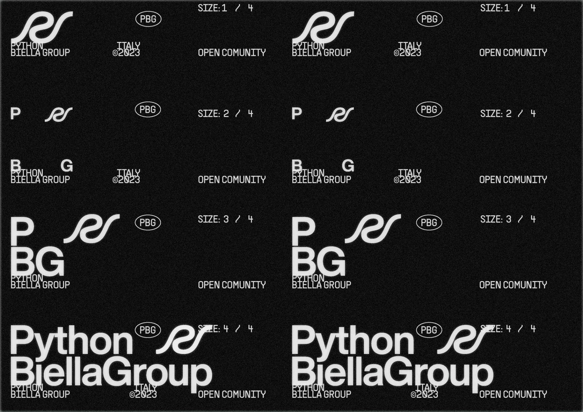
In our new design, Gradient drew inspiration from the zen of Python, the beating heart of this language.
Here's what we've done:
-
We've opted for a black and white color palette to promote simplicity and accessibility.
-
We exclusively use the Helvetica font for all text, as it's an open-source font accessible to everyone.
-
Our iconography has been simplified and made clear, direct, and without frills - just how we like to be and operate.
-
At the same time, we've aimed to be bold and modern.
Saying goodbye to the little bear that has accompanied us for the past 3 years was difficult, but we felt it was time for a change!
We hope you appreciate our new look as much as we do.